Leave Your Message

How to Choose Photo Printing Paper for Your Business in 2026?

Choosing Photo Printing Paper in 2026 is not just a matter of picking the glossiest sheet. The right paper affects color, texture, drying time, durability, and the way customers perceive your work. A vivid product image may look striking on glossy stock, while a wedding portrait can feel warmer on a softly textured matte finish. Small details matter.

For a business, the best choice depends on what you print, how you print it, and what customers expect. Inkjet and photographic processes may require different coatings. Paper weight, surface finish, brightness, and compatibility with your printer all deserve a close look. Check manufacturer specifications, then test samples using your usual images and settings. Compare skin tones, shadow detail, drying behavior, and how prints look under the lighting in your shop or studio. A sample pack can reveal problems that a screen preview will not.

There is no perfect sheet. A paper that works beautifully for gallery prints may be too costly for everyday orders, and a durable finish may not suit every artistic style. Keep notes on test results, including the printer, ink, settings, and paper batch. That makes repeat orders more consistent and helps you explain your recommendations with confidence. In 2026, customers may also ask about packaging and responsible sourcing, so verify claims directly with suppliers instead of relying on vague labels. Your final choice should balance image quality, reliable production, customer needs, and realistic margins. Some trade-offs remain. A careful paper test is a practical starting point.
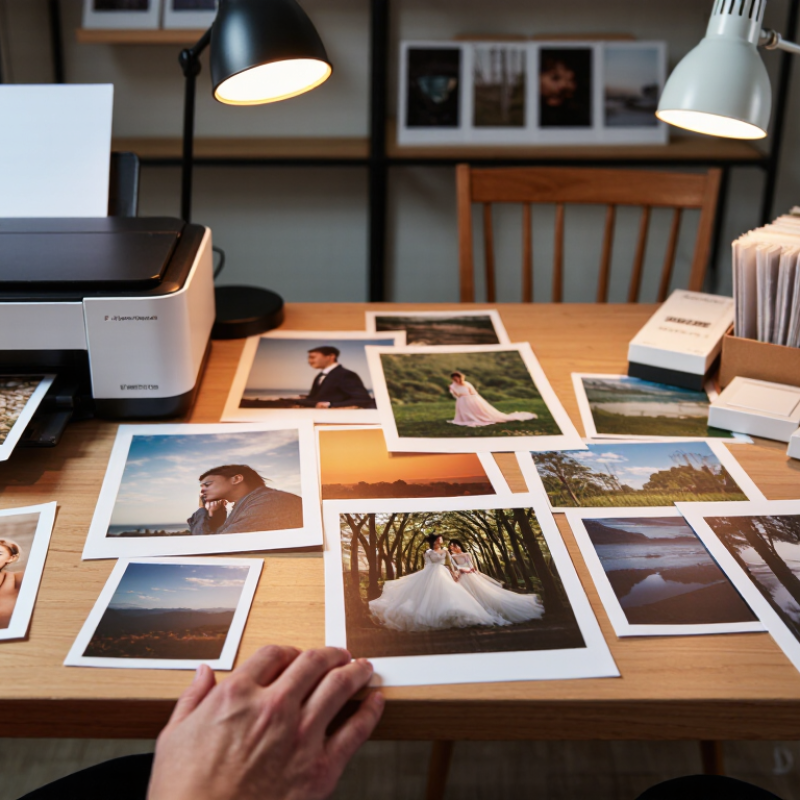
How to Choose Photo Printing Paper for Your Business in 2026?

Define print用途: albums, displays, and common 180–300 gsm stocks

How to Choose Photo Printing Paper for Your Business in 2026?

Start with the print’s purpose. Albums need pages that turn easily and resist handling. For many album projects, 180–220 gsm paper offers a practical balance between flexibility and substance. Heavier sheets can feel premium, but they may make thick albums awkward to bind. For display prints, such as framed portraits or studio samples, 250–300 gsm stock can feel sturdier and lie flatter.

Feel the difference. A paper’s surface matters too: glossy finishes deepen color, while matte surfaces reduce reflections under bright room lights.

Tips: Order small samples before committing to a full stock. Print the same image on each sheet, then compare skin tones, shadow detail, and drying time. Check how the paper behaves in your printer; gsm alone does not guarantee compatibility or image quality. A heavier sheet is not automatically better. It is easy to focus on the first impression and overlook storage, binding, or display conditions. Test before ordering.

Compare gloss, lustre, and matte finishes across resin-coated and fine-art papers

A finish changes how customers read color, texture, and value. Gloss gives photographs crisp contrast and saturated color, but bright shop lights can create distracting reflections. Lustre softens glare and resists visible fingerprints, making it a practical choice for handled sample books. Matte feels quieter and reduces reflections; deep blacks may look less punchy, depending on the paper and printer. Small differences matter. Compare the same image under your actual display lighting.

Resin-coated (RC) papers suit fast-turnaround photo work: their sealed surface typically dries quickly and handles routine handling well. Gloss and lustre are common RC options. Fine-art papers, often made from cotton or alpha-cellulose, offer tactile surfaces and subtle matte rendering. They can make portraits and limited editions feel considered, but absorbency and texture may soften fine detail. “Archival” is not a finish; check paper specifications and print-system compatibility.

The market is growing, but that does not mean every shop needs a premium stock. Smithers’ report The Future of Digital Printing to 2032 valued digital print at $136.7 billion in 2022 and forecasts $230.5 billion by 2032. FESPA’s 2023 Print Census found 83% of respondents expected business growth. Use that context to test a small set, not overbuy. Print one skin-tone portrait and one shadow-heavy image on each candidate; inspect them under daylight and your shop lights. This test is imperfect, but it reveals more than a screen preview.

How to Choose Photo Printing Paper for Your Business in 2026? - Compare gloss, lustre, and matte finishes across resin-coated and fine-art papers
Paper family Finish Typical surface and construction Image appearance Glare and handling Best-fit business uses Practical trade-off
Resin-coated (RC) photo paper Gloss Paper base enclosed by polyethylene layers, with an ink-receptive coating; smooth, reflective surface. Strong perceived contrast and saturated color; smooth surfaces can show fine detail clearly. High reflections under direct light. Surface can show fingerprints, scuffs, or handling marks. High-volume photo labs, event prints, albums, and images intended for display behind glazing. Often efficient for routine photo production, but reflections can distract in bright rooms.
Resin-coated (RC) photo paper Lustre RC construction with a lightly textured or low-sheen surface; the exact texture varies by paper. Good color and contrast with a less mirror-like appearance than gloss. Generally reduces visible glare and fingerprints compared with gloss, though it is not glare-free. Portrait studios, school photography, wedding packages, and general-purpose customer prints. A versatile compromise, but surface texture may be visible in close-up viewing.
Resin-coated (RC) photo paper Matte RC base with a non-gloss ink-receptive top layer; surface texture ranges from smooth to lightly textured. Soft, low-reflection appearance; perceived blacks and color intensity may be less striking than on gloss. Low glare. A matte surface can still mark or abrade, depending on its coating and handling. Proofs, handouts, display pieces in brightly lit spaces, and images where reflections are unwanted. Practical for viewing under varied lighting, but may not deliver the punchy look some photo buyers expect.
Fine-art inkjet paper Gloss or baryta-style Typically a cotton or alpha-cellulose paper base with a specialized inkjet coating; baryta-style surfaces are designed to evoke a traditional glossy photographic look. Can produce deep-looking blacks and rich tonal separation when matched to the printer, ink, and image. Reflective; handling marks may be noticeable. Surface sheen and texture differ among papers. Exhibition prints, premium portfolios, and limited-edition work where surface character is part of the presentation. Usually positioned as a premium print option; careful handling and suitable display lighting are important.
Fine-art inkjet paper Lustre, satin, or semi-gloss Fine-art paper base with a coated surface offering some sheen; availability and texture vary by paper type. Balances tonal depth with a more restrained sheen than full gloss. Typically less reflective than gloss, but still shows some highlights under direct lighting. Premium portrait work, portfolios, and art prints for customers seeking a middle ground between gloss and matte. Surface descriptions are not fully standardized, so reviewing a physical sample is useful before offering it.
Fine-art inkjet paper Matte Often cotton or alpha-cellulose with a matte inkjet coating; may be smooth, textured, or made with a pronounced art-paper surface. Subdued sheen and a tactile, paper-like presentation; tonal character depends on the coating and image. Very low surface reflection. Textured surfaces can collect dust, and delicate coatings require careful handling. Fine-art editions, illustrations, muted-color work, and prints intended for galleries or premium framing. Distinctive surface character, but it may not suit every photographic style or customer preference.
Selection note: RC describes a paper construction, while fine-art paper commonly refers to a paper type or intended market; neither term alone determines finish or print performance. Surface, color, drying behavior, water resistance, and compatibility vary by product, ink, and printer. Compare sample prints under the lighting in which customers will view them.

Match paper weight to printer feed limits and images prepared at 300 ppi

Paper weight should fit the printer’s feed limits, not just feel substantial in your hand. Check the manual for the supported paper range and whether it applies to the main tray, rear feed, or duplex printing. A heavy sheet may work through a straight path but jam in a tight roller path. Coatings also affect thickness, so two papers with the same weight can feed differently. Test one sheet.

Prepare images at 300 pixels per inch at their final print size. An 8-by-10-inch image needs about 2400 by 3000 pixels for that resolution. Enlarging a small file does not add real detail; edges may look soft, especially in fine text or hair. Check the image dimensions before sending a full batch.

Make a small test print on the paper you plan to use. Look for skewed edges, roller marks, slow drying, and curled corners. I find it tempting to choose the heaviest stock for a premium feel, but that can create feed problems without improving the image. Start within the printer’s stated limits, then adjust paper weight and image settings based on the actual result.

How to Choose Photo Printing Paper for Your Business in 2026?

Match paper weight to your printer’s feed limits, and prepare images at 300 ppi. The chart shows the pixel dimensions required for common print sizes at that resolution.

Pixel dimensions are calculated as print size in inches × 300 pixels per inch. Paper weight is measured in grams per square metre (gsm), but supported weights vary by printer. Check the printer’s media specifications before selecting heavier paper, and use a suitable manual or rear feed if recommended.

Assess color and tone using ICC profiles, gamut, and maximum black density (Dmax)

When comparing photo papers, do not judge color from a screen alone. Ask for the correct ICC profile for your printer, ink, and paper combination. This profile predicts how colors may reproduce under specific settings. It is a map, not a promise. A mismatch can shift skin tones or flatten subtle shadows.

Check gamut with images your customers actually order. A vivid sunset, a deep blue jacket, and a neutral gray card reveal different weaknesses. Print the same file on each candidate paper, using consistent settings and viewing light. Look for clipped highlights and colors that turn dull. Small differences matter.

Then assess maximum black density, or Dmax. Higher Dmax can produce deeper blacks, but it does not guarantee better-looking prints. Compare shadow detail, not just darkness. A glossy sheet may show richer blacks, while a matte surface can soften contrast. Neither is automatically right for every job. Keep a small proof set beside your production printer. Even careful testing can miss a problem; mixed lighting once made a neutral print look slightly warm. Recheck under the conditions where customers will view the finished work.

Check print longevity claims against ISO 18937 light-stability testing

An “up to 100 years” claim means little without its testing conditions. ISO 18937-1:2019 provides guidance for measuring indoor-light stability in photographic reflection prints. It does not make every room equivalent. Ask for the test method, light source, exposure level, humidity, and measured color or density change. The report should identify the tested paper-and-ink combination, not just the paper. Details matter.

For scale, a print displayed at 500 lux for 10 hours daily receives 5,000 lux-hours each day, or about 1.83 million lux-hours yearly. This is an exposure estimate, not a lifespan prediction.

Light spectrum matters. Daylight through glass and warm LED lighting expose prints differently. ISO testing data is useful for comparing samples under controlled conditions, but it cannot reproduce every shop window or office wall.

Request the complete laboratory report, including initial and final readings, the failure threshold, and replicate count. Check whether the claim measures fading, color shift, or both. A strong result under one light source may not transfer to another display environment. Ask the supplier how the tested setup matches your own lighting and display hours. If the answer gives only a number of years, pause. Those years depend on assumptions.