How to Choose the Right Offset Paper for Printing?
Choosing the right Offset Paper starts with the job, not the paper catalog. A crisp annual report, a colorful product brochure, and a bulk mailing place different demands on a sheet. Consider what readers will see, touch, and handle. Fine text needs a surface that keeps letters clear. Photographs need suitable ink holdout and enough opacity to limit show-through. Covers may need more stiffness than interior pages.
Weight matters, but it is only one part of the decision. Compare basis weight, thickness, brightness, shade, and surface finish. Uncoated paper often gives a natural feel and works well for text, while coated stocks can show images with sharper detail. The right choice also depends on press settings, ink coverage, folding, and finishing. Grain direction can affect how a sheet folds and binds. Small details count.
Ask the printer which stocks have performed well on the actual press. If the project is important, request a printed sample or press proof before approving a large run. A digital mockup cannot fully show how ink sits on paper or how a finished page feels. Check availability too; a preferred stock may not be easy to reorder. There is no universal best sheet. And paper samples can be misleading. Lighting, screen previews, and handling all shape perception, so judge the stock in conditions close to its final use. A test may reveal a choice that looked perfect on paper—but not in practice.
Understanding Offset Paper and Its Main Types
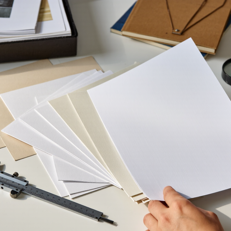
Offset paper is designed for sheet-fed or web offset presses, where ink transfers from a plate to a rubber blanket, then to paper. Most grades are uncoated and absorb ink readily, producing a natural, low-glare surface. Coated offset paper has a smoother mineral coating, which keeps fine type and images sharper. Recycled grades use recovered fibre; their shade and surface can vary more between batches. Small differences matter.
FAO’s 2023 forest-products statistics put global paper and paperboard production at about 401 million tonnes in 2022. That figure covers many grades, not offset paper alone, but it shows the scale of paper manufacturing. For a specific job, compare basis weight, opacity, bulk, and surface finish; ISO 536 provides the standard method for measuring grammage. A lightweight sheet may lower mailing weight, yet show-through can spoil double-sided text. An uncoated sheet suits readable reports and forms, while a coated grade often preserves detail in photographs. Recycled stock can look slightly warmer. Not always. Ask for a press proof, since screen previews cannot reveal ink absorption, curl, or how a sheet feels under the fingers.
Defining the Printing Project’s Requirements
Before choosing offset paper, define what the printed piece must do. A two-sided event flyer has different needs from a thick product insert. Note the finished size, page count, print quantity, and whether readers will write on it. These details narrow the options and help avoid paying for weight or finish the project does not need. Check the printer’s equipment limits, too; a preferred sheet may not feed reliably through every press.
Next, consider the look and handling. Coated paper can make photographs appear sharper, while uncoated stock offers a softer surface for text and handwriting. Compare paper weight, brightness, opacity, and grain direction with the design. For example, a folded brochure may crack along the fold if the stock is too stiff or folded against its grain. Ask for a printed sample when color accuracy matters. Digital proofs help, but they cannot fully show how ink and paper interact under real lighting. I have seen teams overlook this until the finished sheets arrive.
Tips: Give the printer the file, finished dimensions, and intended use before requesting a paper recommendation. Ask for two or three sample stocks, then compare them in the actual room where they will be read. Record the chosen paper’s weight and finish on the job brief. A brief can still change; document what remains uncertain.
Comparing Paper Weight, Brightness, Opacity, and Finish
How to Choose the Right Offset Paper for Printing?
Paper weight affects both the feel of a printed piece and how it runs through a press. A lighter sheet can suit book interiors, while a heavier stock may feel more substantial for covers or cards. Weight alone does not tell you thickness: different paper grades can feel different at the same gsm. Feel the sheet. Check the printer’s recommended range, especially for folded or multi-page work.
Brightness influences contrast. A brighter sheet can make dark text and crisp images appear more distinct, while a softer white may feel easier on the eyes for long reading. Opacity matters when printing on both sides. Hold a sample toward a light; if the reverse-side text shows through, choose a more opaque sheet. Finish changes the surface, too. Uncoated paper absorbs ink and feels tactile, while coated finishes can render images with sharper detail. Results vary with ink and artwork, so a sample is more useful than assumptions.
Tips: Test a printed sheet under the lighting where it will be read. Check color, show-through, folding, and feel. One small test can prevent a costly mismatch. I sometimes overvalue brightness; in practice, the right choice depends on the job.
Matching Paper Properties to the Printing Method
Matching offset paper to the press starts with the ink, drying system, and image detail.
ISO 12647-2:2013 defines five substrate types, ranging from coated glossy paper to yellowish uncoated stock. This classification helps printers set color targets for the actual sheet, rather than relying on a screen preview. For sheetfed work with fine text or photographs, a smooth coated sheet can hold sharper edges. Uncoated paper absorbs more ink, often softening detail and slowing drying. Test the chosen weight and finish on press; the result can differ from a small proof.
Web offset needs a closer match between paper and drying method.
Heatset presses use heated dryers, so the stock must tolerate that process without excessive curl or waviness. Coldset printing, common for newspapers, relies on porous paper to absorb ink; highly coated stock may dry poorly. Fogra’s ProcessStandard Offset guidance treats substrate, ink, and press settings as linked process variables. A practical check: compare paper samples for bulk, opacity, surface, and moisture, then confirm register and drying on a production-speed run.
Small differences matter.
A glossy sheet may boost contrast, but glare can make reading harder under bright lights. Lightweight stock saves weight, yet show-through may trouble dense pages. Paper data sheets help, though they cannot predict every press condition. I would verify the exact grade with the printer, record the successful settings, and keep a signed sample for repeat jobs.
Testing Paper Compatibility Before Final Selection
Before committing to an offset paper, test it on the press that will run the job. A practical trial can reveal feeder misfeeds, slow ink setting, excessive show-through, or curl after drying. Record the paper’s grammage using ISO 536 and thickness using ISO 534; these measurements help compare samples against the press’s reliable operating range. Check surface strength and ink absorption too. A sheet may feel smooth yet still shed fibers or scuff under production conditions. Small test. Worth it.
Run enough sheets to include a steady press speed, not just a few careful impressions. Compare color, registration, drying, and pile behavior with your current stock. Measure color differences with a spectrophotometer and use the same settings for each sample. ISO 2470-1 provides a standardized method for measuring diffuse blue reflectance, useful when brightness affects the appearance of uncoated paper. Keep a simple test log with the paper lot, room humidity, ink coverage, and press settings. Those details matter: paper can behave differently when the pressroom is dry. A 200-sheet trial is a practical starting point, but it is not a universal industry threshold. Increase the run for high coverage or tight deadlines. I would not judge compatibility from one successful sheet; that’s an easy mistake.
How to Choose the Right Offset Paper for Printing?
Compare common paper weights as a starting point for print trials.
These are representative, commonly used basis weights, measured in grams per square metre (gsm). A heavier sheet is not automatically a better match: test the actual paper on your press for feeding, ink drying, show-through, and finished-piece handling before making a final selection.